- PureMart has been designed to work in any joomla template you have picked. For the uniqueness, some people build their own joomla template sometimes. And you might guess, there are millions of joomla templates around in the internet both free or commercial. But only %0.1 of them have a Virtuemart support. By PureMart you are going to add "Virtuemart" Support to those joomla templates. This is why we have used beez_20 joomla template in the PureMart DEMO (beez_20 joomla template comes free with joomla by default, that beez_20 can be anything...)
- DarkMart itself is a joomla template, but also has influence on Virtuemart. With DarkMArt, you don't need a Joomla template at all. But for the uniqueness, you are stick with 1 design. Which might limit you in some cases, because it doesn't give you flexibility to have different website designs for each projects.
From the "Virtuemart" standpoint, DarkMart and PureMart has no difference. They both have influence on Virtuemart related pages. It is all up to you to pick one in terms of design. If you like the design of DarkMArt, then you should pick DarkMart and get the "all-in one" bundle, or you can build or get your joomla template from somewhere else then add the "virtuemart" support into it by PureMart.
Theatrically speaking;
- PureMart is a Virtuemart Theme
- DarkMart is a Joomla Template + Virtuemart Theme
There is no specific difference between them, it all depends on what you are looking for.
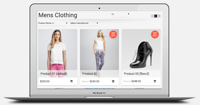
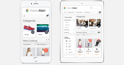
About the responsiveness, yes that is correct, if your joomla template is responsive, then PureMart will become responsive as well. But i should mention about it, not everything comes "ready" out of the box. Because we don't know what media queries your joomla template is using. (every joomla template use a different structure for responsive layouts). Therefore, you might need to make some edits in your responsive.css file, which is located here: /templates/YOUR_TEMPLATE/css/responsive.css. Most of the joomla template uses this CSS file for responsive layouts. For instance, the TABs in the product details, might not look good when the layout is small (especially on iPhone). Therefore, they would require some customization through responsive.css, such as, changing float:left of each TAB and make them display:block; and make them width:100%. So every TAB will have 100% width, which will look better in iphone screen.
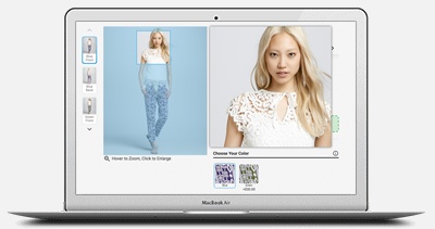
But those modifications are all CSS-based. CSS-based modifications are relatively easier than JS-based modifications. For instance, the zoom effect extension (which is jQuery-based) works just fine alright with touch-based devices (in PC, the zoom effect start working when mouse hovered and when you move your mouse over the thumbnail; in mobile devices, the zoom effect starts working when you touch the thumbnail and move your finger over the thumbnail. )
Regards.
Support & Development

 $0.00 (0 items)
