Hi,
In my previous post, i made a mistake and gave you faulty CSS declaration.
Replace it with this:
@media screen and (max-width: 568px) {
  #maininner, #sidebar-a, #sidebar-b  { left:0px !important;}
  #bottom-b div.grid-box { width:50%;}
}
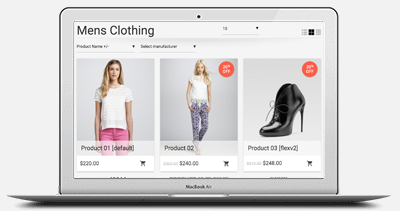
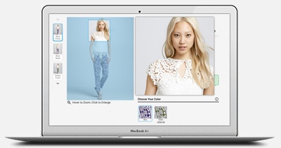
And the problem in the 2nd screenshot will be resolved. About the 1st issue you are having. It literally has nothing to do with our template. Therefore i can't help you with it. But it looks like a
display:table; and
<p> issue. So, it can be solved via CSS modifications.
TIP: I would suggest you to use 1 module and include all those 5 banner side by side. You don't need to create 5 modules. You can use DIV class name of
width20 and
floatleft.
For example, create only 1 custom HTML module in that position and use this HTML scheme below: (to list 5 banners side by side)
<div id="topBanners">
<div class="width20 floatleft">
    <a href="bannerURL">
         <img src="bannerImagSRC">
    </a>
</div>
<div class="width20 floatleft">
    <a href="bannerURL">
         <img src="bannerImagSRC">
    </a>
</div>
<div class="width20 floatleft">
    <a href="bannerURL">
         <img src="bannerImagSRC">
    </a>
</div>
<div class="width20 floatleft">
    <a href="bannerURL">
         <img src="bannerImagSRC">
    </a>
</div>
<div class="width20 floatleft">
    <a href="bannerURL">
         <img src="bannerImagSRC">
    </a>
</div>
<div class="clearfix"> </div>
</div>
and to CSS, include this CSS rule below to limit the image sizes:
#topBanners img { max-width:100%;}
Regards,
Support

 $0.00 (0 items)
