Hi,
Sorry for the late reply but John didn't let me know about this topic. Or somehow i have missed it.
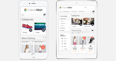
The 1st and 2nd inquiries you mentioned are not "bug", this is how things were developed. Those are the way they are in our DEMO as well. Since the spaces are limited in the responsive design (especially in the iPhone layout) we needed to eliminate some sections to make things look nice and compact. But you made a good point, especially the availability icon is an important element, so it should visible no matter what layout it is. I will consider this for the next version of LightMart definitely.
If you are familiar with those things, you can do your own patch through this CSS file:
/templates/flexible_lightmart/css/responsive.css
and eliminate this CSS rule:
.FlexibleEnlargeView, .FlexibleAskQuestionElement, .availability, .FlexibleShareItemLeft {display:none;}
(you might need some further CSS modification, the layout won't look perfect after making them re-appear)
About your last inquiry, it must be because of the "Facebook" Like box, it has large width value than the browser size. But the point it; Facebook like box (officially) has different layouts for PC and for Mobile devices. If you decrease the browser width, the facebook like box won't fit there. But if you browse your website with iphone (or smart-phone) facebook like box will load the mobile version, so this problem won't happen. Do you have the latest version of LightMart ? Does this problem happen in our DEMO as well?
Regards.
Support & Development

 $0.00 (0 items)


